Tables Aren’t Boring, You Are
Tables are the backbone of data visualization. Not only is it often the framework we use to structure our data before we bring it into our platform of choice, it can be a really impactful layout to show data to the end user. It offers a versatile and comprehensive view in a way that’s unmatched by most other charts. But it doesn’t have the best reputation; people tend to think it’s rather boring. But that’s because they haven’t uncovered some of the vast possibilities around making tables, especially in a tool like Tableau that has next to unlimited potential for customizations. So Luke Stanke and I decided to take to the stage at TC23 to show everyone just what tables can do for them.
In our session, and this blog, we talked about how smart design choices and layering in contextual elements and interactivity can kick your tables up a notch. Here are some of those tips with accompanying blogs to support you when you go to implement them in your next dashboard.
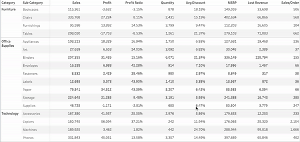
MAKE THEM LEGIBLE
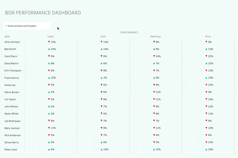
Tables can be a bit of an eye chart. One of their values is their ability to provide a lot of information in a single view but it can only have an impact if the user can easily read what’s in it. And that’s part of why this is our first tip because it lays the foundation for all of the other components that get layered on later. It’s important to use design best practices to ensure that the fonts choices, spacing, and dividers are appropriate for the end users.
Pick appropriate font types and sizes
Differentiate headers from the body
Get rid of distracting row banding or border lines
Ensure each row has adequate space
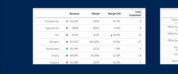
ADD OTHER MARKS
When people think of tables they think of text. But there's so much more opportunity especially within tableau. There are a lot of tricks to make it possible to add different mark types which is going to help your users more easily identify what's going on. This will help you as a developer make specific callouts based on patterns within the data or things that might be more relevant to the business at the time. This tip is mainly about exploring the potential of adding additional components to your tables besides just text.

So we talked about the ability to add additional mark types to your tables to make them more helpful and visually interesting. But sometimes this requires adding additional sheets which can become a problem if your table has more rows than can fit in the view and scrolling is necessary. Making sure that the values line up appropriately across is going to be really important so your users don’t get lost in the information.

Now there are a couple ways to integrate additional mark types into a table. But one of the more powerful and consistent ways that was released in the past few years utilizes map layers. This overall is going to make a more seamless table but it does require some additional work to get it there.

OFFER DYNAMIC ORDERING
Part of people’s critique is that tables can be really static. Natively, there’s not a lot of manipulation to allow the end user to navigate through the story of the data. This challenge only increases as we include more values to the table. Adding the ability to sort the columns will help ensure the audience can move through the table in a way that’s meaningful to them. It also keeps it flexible so that overtime as interest areas change, the table can change with it with low intervention from the developer. (e.g. we’re really focused on decreasing returns this year but last year we were focused on increasing profit).
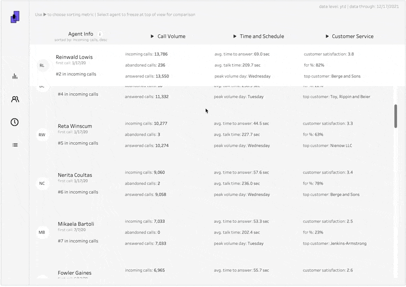
ALLOW TARGETED REVIEW
People often request tables because they want to see a lot of information at a granular level. And they normally want this so as they identify patterns, they can dig into some of the underlying information. But pinpointing outliers or particular use cases can be difficult when looking across an entire table. Giving them the ability to freeze a row while being able to move through the table can help then hone in on particular focus areas.
Let’s take the above tip a step further. So we’ve given them the ability to dive in a particular data point. Now what? How does it compare to the other values? Adding automatic comparisons will enable the user to easily identify how the performance of that data point fits within the larger ecosystem.
PROVIDE MORE CONTEXT
Less is more. Except for when more is more. By that I mean, in tables you don’t want an overwhelming amount of information because it takes away from the key analysis but sometimes it’s necessary to add contextual information. May I introduce you to having your cake and eating it too? With Tableau’s new feature, Dynamic Zone Visibility, it’s easier than ever to layer in additional information (it’s possible without zone visibility, see more commentary on that in an upcoming blog). Give them the ability to dig a little deeper without taking away from the primary focus.

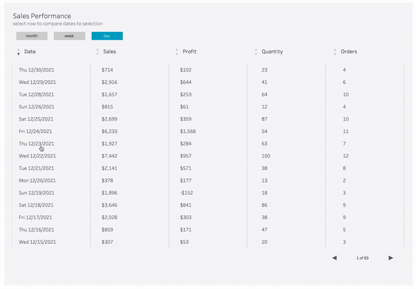
ADD FLEXIBILITY
Every tip we’ve outlined here is to increase the ways that a table can support the users. And in a lot of these methods, we’re adding ways to make the table more flexible to adapt to different situations. Another way to do that is giving them the option to “toggle” some of the functionality provided (gif shows how to toggle on and off pagination). This is is mainly just to prompt you to think about more ways that the table might need to adapt to different use cases.
Give The People What They Want
They’re gonna ask. You know it, I know it. They know it. So just give them the option. Of what, you ask? Exporting their data to Excel. It’s sacrilege I know, and I hope for the life of me Francois doesn’t see that I’ve said this. But a lot of companies haven’t completely moved away from side, ad-hoc, back-of-the-napkin then email it to a colleague analysis. So providing them with the tools they need to make it easier can benefit you both in the long run.
Tables should be in every developer's tool belt and they’re something that's asked for by stakeholders frequently because they’re familiar and powerful. So we hope that we provided you the tools to enable you to take your tables to the next level.