Kicking It Up A Notch
Good design and mindfully included interactivity can make the difference between a dashboard that someone looks at and one someone uses.
When I approach dashboard design, I normally think about how to create experiences for the user that feel intuitive, seamless, and if possible, fun. But it is possible to overdo it. Design can help not only attract but keep and motivate your audience but it should not impede on the dashboard’s function. One of the easiest ways to hit that sweet spot is to think about ways to elevate what you’re already going to be presenting as opposed to layering on additional elements.
One place I did this recently is in my Insurance Dashboard and to demonstrate my point further, I’m going to walk through 5 things I added to the dashboard to kick the UX/UI up a notch.

Customized Greeting
Anytime I include this people think it’s magic and it’s so simple! Talk about a lot of bang for your buck. No calculations necessary (though it is a function) to greet your viewers by NAME. The Full Name field exists in text objects on dashboards, in sheet titles, and tooltips. I’m introducing you to this list by telling you to introduce your users to the dashboard. Does this make the biggest difference? No. But it’s that extra touch that lets them know you really thought about the whole experience. Worth adding for sure. You can find out more about user functions here.

Dynamic Instructions
I feel like item number 0 would be to put instructions on the dashboard. Don’t be shy about your interactivity, let it strut! Not calling it out (e.g. a click to filter action) leans on the assumption that a user is familiar with Tableau which may not always be the case. Additionally, it can be very confusing if the user enables it by accident. So yeah, callout 0 is put it on there!
But, once it’s on there, think about whether or not it works in all situations. People often place instructions to trigger a certain response but don’t provide the additional context of how to move either back to the default or on to the next thing. One thing I included in a few areas of this dashboard is instructions that change depending on whether or not the first step has been carried out. Take the example above. I’m telling the user that clicking the area will display time period options. Once they have clicked, I let them know they could close this menu by clicking again.

Nested Navigation
The ‘agent analysis’ page was the biggest to tackle. There was a lot of information I wanted to display. I wanted to allow the user to compare the agents with one another across a number of metrics but I also wanted to be able to take a deep dive into each individual. And further into that, there was several lenses I wanted to be able to analyze the agents on. This easily could have been a whole workbook on its own. But I wanted to contain it as much as possible so it presented as a “one stop shop” where you could find out more about the agents which was just one component of the overall workbook.
To achieve this I did a couple of things. One is having the list of all agents on the side that the user could sort across metrics with accompanying ranks. But the thing I really want to highlight is the main section of this dashboard where you can navigate between different views (performance, products, claims) for the selected agent. This allowed me to present a lot of analysis options without it getting too overwhelming with multiple tabs dedicated to agents or a lot of competing charts visible at the same time.
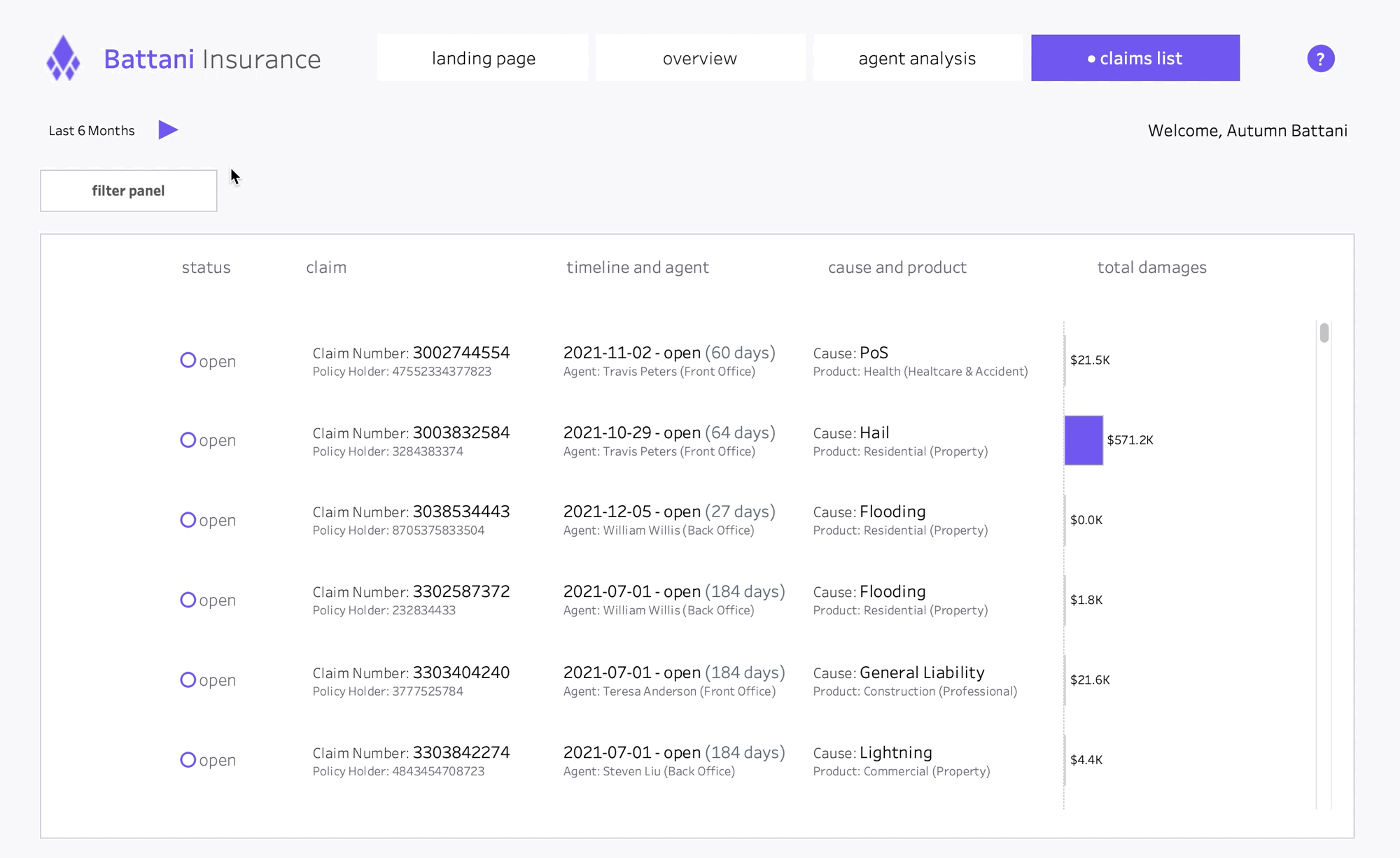
Active Filters List
I could write an entirely separate blog on whether or not to have filters always visible on the dashboard. I’m going to quote a wise man, “it depends” - Will Perkins. But I decided for the analysis on the claims list dashboard I wanted to provide filters but not have them statically positioned (and really what it came down to is taking up real estate). One risk with this that I’ve seen is people not realizing or remembering that certain filters have been applied. I decided to solve this by creating a menu at the top that would display if a filter was active (when no filters are active this area is blank). This allowed me to reduce the clutter in the view while keeping the user informed about actions that have been taken.

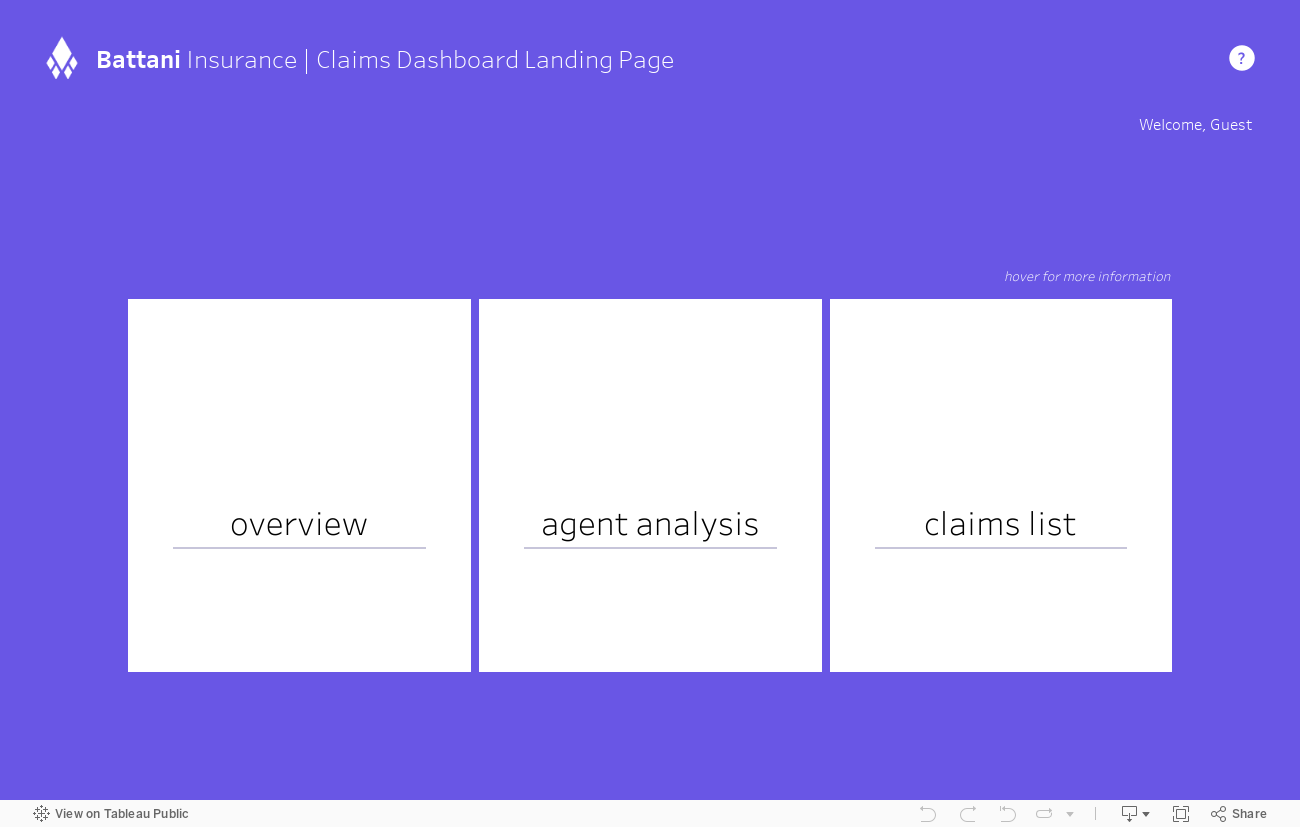
Landing Page
I love me a good landing page. I think they’re a great way to make people who may be new to the dashboard feel welcome. In my opinion, the best use of a landing page is to tell the users what analysis is available within the workbook. Now I think the inclusion of the landing page is an item in and of itself. But of course I wanted to take it a step further. If you can’t tell by previous items on this list, I’m all about reducing on screen clutter. So I didn’t just want a list of the pages and descriptions (note: though this is absolutely acceptable and I’m not speaking poorly on it, it’s just not my style. I think it would look perfectly fine, especially with only 3 pages. But this option does scale better in my opinion). Instead I wanted it to be dynamic where the description could be visible if the user were interested in that view/tile but otherwise hidden. I’ve gotten a couple questions on how to do this as well so I made a video tutorial which can find below!
There’s a lot of other little things I included throughout but these are just a few I wanted to highlight. This isn’t necessarily a list of things I think all dashboards should have but more encouragement to think about how to elevate the things you’re already doing. I hope this was helpful and gets the gears turning for your next dashboard.
For more info on how this dashboard came together, check out this thread where I link inspiration and tutorials.